

Give user inputs for Watch History
Manage content with the ability to mark it as watched/unwatched.
Overview
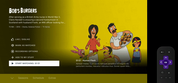
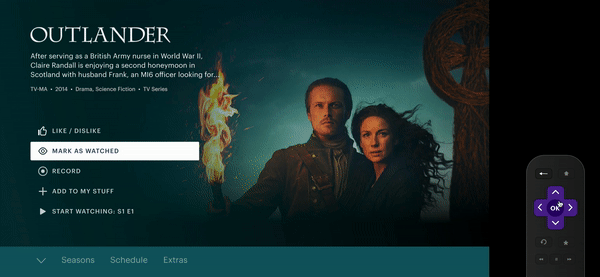
The “Mark as Watched” feature gives viewers direct control of their watch history at a series, season, and episodic level. The “MAW” button will be accessible via details pages and browse tiles. Updating your “watched” status overrides your watch history, to help improve the user’s continue watching experience.
This feature has powerful personalization implications with autoplay, keep watching, and smart start, improving these key areas has incredible impact as continue playback constitutes nearly 70% of views on Hulu.
TIMELINE
12 Months
LAUNCHING
June 2021 (Q2)
ROLE
Product Designer
COMPANY
Hulu
Introduction
Background
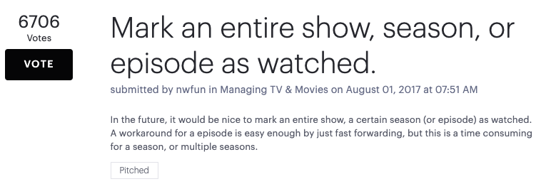
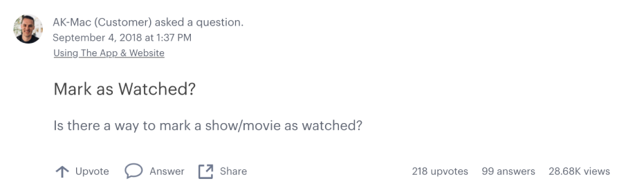
According to Viewer Experience Mark as Watched became the MOST requested feature in Hulu’s history. The Community Feedback came back with over 6,400+ votes and 816+ comments (with additional mentions from social media like twitter, reddit, etc..), from this data we found that users felt that they had no way of managing their watched content.

The Team
I was the sole Living Room Designer on this project. Collaborated with 2 other designers, UX copy writer, UX research, UX Platform team, product manager, front-end/back-end engineers, VX, and the product marketing team.

Understanding the Problem
Competitive Analysis
We needed to understand what it means for viewers to expect to manage content in the context of other competitors. This was to discover where the feature lived, iconography, and how in depth managing watched content is. Based off what was researched, I found out not a lot of competitors created a Mark as Watched experience for Living Room but mainly for web.

Workshop 1 - Investigation
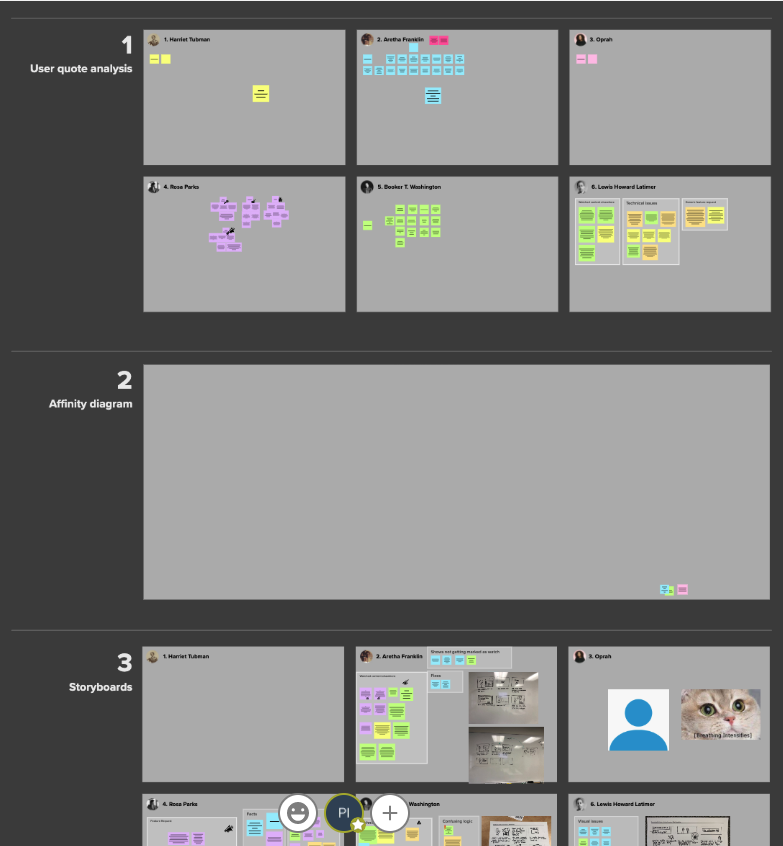
Strategized to further understand why this request existed, I worked with other designers to facilitate an Investigation Workshop in the Seattle and Santa Monica office where we invited designers, developers, PMs, Viewer Experience, and more. (20+ attendees)
We had participants review user pain point quotes that were collected from social media platforms, community threads, and VX. We then had participants group them based on common themes title the groups. Afterwards we had participants work in groups to storyboard a user’s experience based on the group of stickies they were given to better unpack the issues they were experiencing.


Workshop 1 - Insights
From the workshop, we’ve collected enough insights to grasp where the true problem lies as well as discover the common pain points.
Problem Statement
How can we make playback more accurate for our users so that they can watch what they want?
Primary Pain Points
Watched on another service: Either before joining or in parallel with Hulu subscription
Accidental Viewing: Corrective action if a users leaves programs on in the background
Shared Profiles: Other people viewing content in or out of their household
Live viewing: Unintended WH from live channel surfing
Incorrect view complete status: Resolves metadata, resume state, errors & user issues
Workshop 2 - Metrics
After the first round of user testing, our team ran another workshop to create metrics for the project. We had stakeholders help create and define what metrics we would use to gauge the success of this project once it is released. This helped us understand what instrumentation was needed in order to properly monitor the feature. (Link to view full metrics)
To assess progress, we'll collect these metrics: [Samples]
Pre/New/Launch:
% of engagement for Keep Watching: before the launch of MaW vs after the launch
% engagement on avg when a new sub user begins to manage their MaW content the first month as a new account holder
Track Performance % first month MaW will launch
# of content that is left in Keep Watching will decrease after launch.

Explorations
Designs
Using the results from the workshops we started ideating on how we could help users inform Hulu on what they have and have not watched. This was an iterative process which involved rounds of feedback from stakeholders, leadership, and IC’s.
Throughout these early explorations we considered how this could be integrated into a user’s experience from on-boarding to the live guide and more. We also looked at what areas within the app would adjust/update based on what a user marks. After rounds of feedback and iterations we narrowed down an experience that seemed to satisfy user’s pain points.


User Flows
After getting a design direction down, we created user flows to understand the overall steps user’s could take to mark content as watched/unwatched as a whole experience. We considered how this would work for series content vs single entities. The next steps were to take our designs and user flows and create prototypes to test with users.


Improving Watch System
Working with the PM and other designers, we created an overview of how to improve the watch system was created to re-imagine when something is marked as watched and unwatched.

User Testing
Rapid Test
Wanting to validate the designs, There were 2 rounds of testing where we created a test script and prototypes in order to perform rapid testing to see if users understand how to mark a series, season, & episodes as “watched”on Living Room and Mobile. We also tested copy as well.
Due to COVID and working remote, we did remote unmoderated testing for this project. Another designer (Devin P.) and I collaborated with UX Research to import everything into Usertesting.com.
What - Remote task-based usability study and exploratory interview questions
Where - usertesting.com
Who - 6 Hulu users
When - Aug 2020
Tasks
Mark a TV Series as Completely Watched
Mark a Season as Watched
Mark Multiple Episodes as Watched
Mark an Episode as Unwatched
Synthesizing Test Results
In order to analyze the test videos, we used the Six Minds Technique to identify the user behaviors and patterns. Once all the videos have been watched and analyzed the findings or quotes into Mural, we would then document the data into a deck and present it to the stakeholders. Here are a few key takeaways from the 2nd round of testing.
Key Takeaways
Mark Series as Watched
All users immediately understood how to mark a series as watched.
All users found MaW easy and simple
Mark Seasons as Watched
Half (3/6) users thought Mark Season lived under Seasons List and the other half (3/6) though it lived in the Series Level
Users felt discoverability was harder for seasons
Once users learned about this feature existed in episodic panel, they knew immediately how to manage their watched content
Mark Multiple Ep as Watched
Majority users (5/6) clicked “Mark all episodes up to here” to complete this task and had very positive feedback on the action. They felt it was easy and simple to have.
Mark Ep as Unwatched
None of the users understood how to mark an episode as unwatched
Most users (3/6) said they would go into playback and fast-forward back to the beginning

Reiterations
UX Collaborations
Designing a Seasons Picker… (Scrolling edition)
After reviewing the testing results, I did a 2nd round of design iterations to brainstorm how marking seasons will live in the series level for the Mark as Watched feature. I worked with a designer from Platform design team to having a reusable Scrollable Panel component by expanding the LR side panel into having more than 5 options live in a page.


Design x Tech Collaboration
We put in a JIRA investigation ticket for the Living Room Engineer team to look into the capabilities of having a live Scrollable Panel Component. This had me collaborating with tech to figure out the behavior and functionality of the scrolling panel while working within the limitations of CDP (The tool used to build Hulu’s LR exp.). There were multiple rounds of design iterations and dogfooding (QA Testing) back and forth before we finally aligned on the scrolling interaction and design direction. From this I continued to document the changes for the feature design.
Copy, Logic, and Marketing Strategy
Our team worked with stakeholders on a release strategy to breakdown what will launch on each devices per slice. We also worked with Product manager and marketing to figure out a direction for press release and help center. This project also needed logic documentation explaining what happens to different types of content based on certain scenarios. We also worked iteratively with UX copy on how to handle copy changes, confirmation messages, tooltips, and more.
Delivery
Design Documentation
After the testing, design iteration, and scrollable panel investigation, I started to gather everything into a proper spec documentation. This included the high fidelity designs, new components, logic, accessibility (TTS scripts), user flows, and more. During this phase, the team and I collaborated heavily with the PM, developers (front & back-ends), copy writers, platform design team, and marketing to make sure everything was aligned.


Next Steps
Due to the project’s timelines being changed because of the Disney re-org. The feature was pushed back to release in June 2021, our tech teams will be picking up the work for Mark as Watched around March - April 2021. Next step in production for UX is working with the developers to Design QA.

What I Learned / Reflection
What I learned
Throughout the project, there was so many moving parts in a large project. I learned how to collaborate with other people in different groups, staying in constant communication with the core team, and aligning decisions with stakeholders.
As the sole LR Designer, I learned the limitation capabilities for low powered devices and what it means to really collaborate with the developers in the team to problem solve the issues that popped up
This project really had me think about UX in a different way when it came to working on Watched content logic with the back-end developers
Reflection
More than half this project was all done remote and during COVID. From this experience, we learned how to perform remote testing, experiment with virtual working sessions, and learned to collaborate with each other through zoom.
I was very appreciative to have such a great and supportive team during these tough times. It proved that even though everyone was far away, we were able to accomplish something for our users as one team.