User Feedback on Content

Background
Back in 2019, My team and I shipped the Like/Dislike button for Hulu. I worked as a Living Room Designer to deliver designs for the TV experiences across all types of devices (Roku, tvOS, FireTV, Playstation, and more).
TIMELINE
12 Months
LAUNCHED
Oct 2019 (Q4)
ROLE
Product Designer (Living Room)
COMPANY
Hulu
What I did
Working with a team of 7 throughout the course of the project. I helped solidify the direction of the User Feedback feature for all platorms, worked on explorations for Living Room (TV), collaborated with other designers on my team by running a company workshop event, and did iterative testings to continue to develop the recommendation engine for the viewer.
Project Timeline
Here’s an overview of how our timeline/roadmap played out the last 12 months before release. I had joined the project in Nov 2018.

Problem Statement
According to the customer data found through Viewer Experience, we found that viewers didn’t feel confident about their recommendations and wanted the ability to manage their content. We felt that this was a need to solve for as a team.

Exploratory Research Investigation
Pop Up Fair
This was the first project I joined when I started the team. I began working with the team to better understand how we would like to enhance Hulu’s recommendation engine. We worked to create a Company Pop-Up fair with 3 interactive activity sessions, our goal was to understand how people browse and make decisions on picking content.


Research Outcome
Hulu wants to provide a way for Hulu users to give explicit feedback on what they like and don’t like beyond the on-boarding experience. Surfacing content tailored to the user’s preferences will encourage more content consumption and increase the value of profiles. Our team knows what TV shows and movies to recommend to our users is an important part of Hulu’s personalized experience.

Concepts & Ideations
Design ideas
Based off the insights we gathered from the Pop up fair, we then decided to ideate on ways users can get personalized content. We explored ideas from genre pills, mood filters, and giving explicit feedback. We also shared these ideas with the Product folks and other stakeholders on the explorations. After the initial first round of designs and feedback, we decided take them into user testing and work with the user research team.
Research Testing
Usability Testing
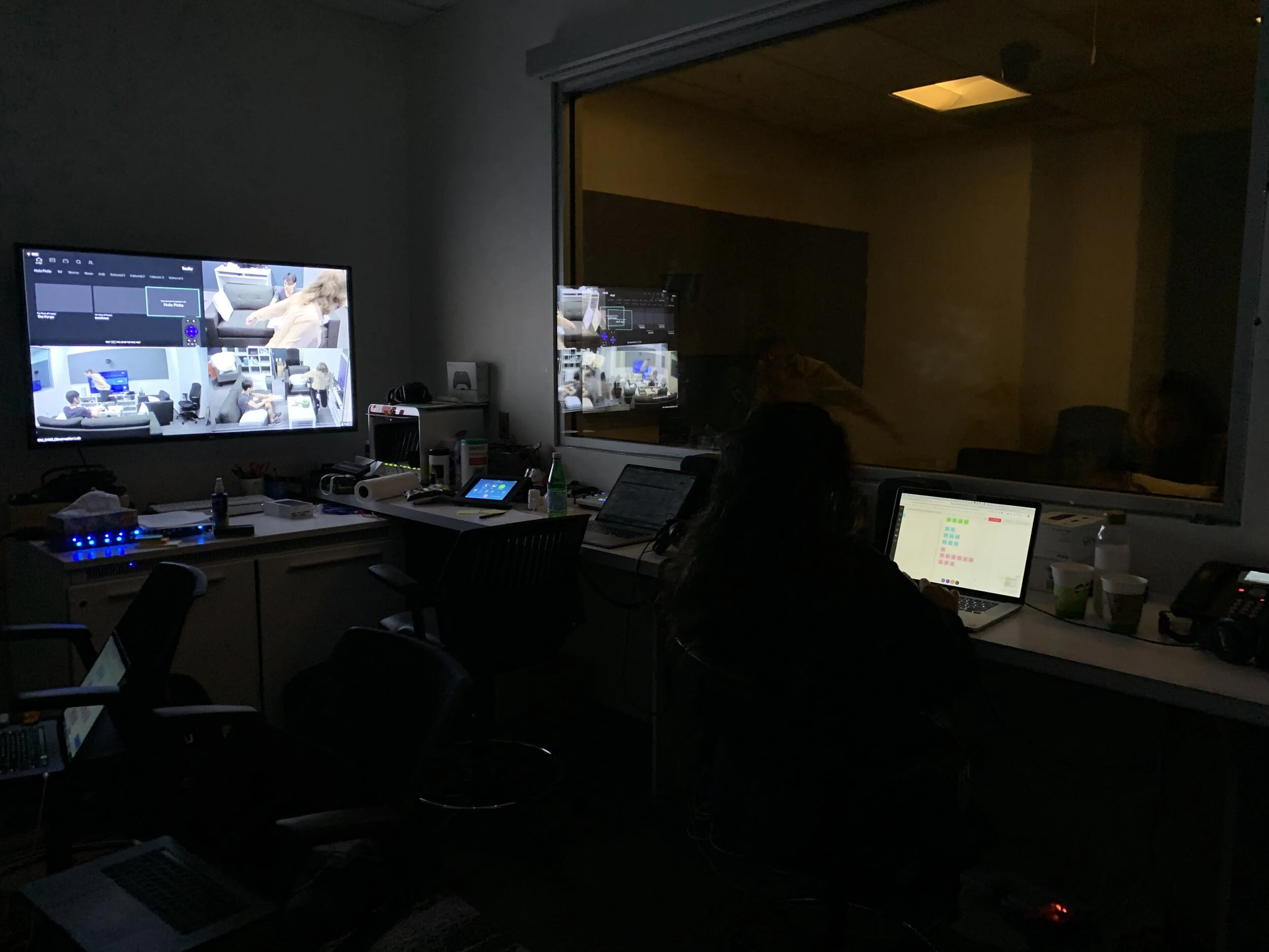
In order to figure out a direction around the User Feedback feature and improving the recommendation engine. We collaborated with the UX research team to conduct a moderated usability testing for Hulu and non-Hulu viewers (8 testers).
Some things we wanted to test are the following
2 Design directions with different types of copy/nomenclatures and iconography.
Explicit extended feedback on “Tell us Why”.
Having an “interests” page in Profile dedicated to allow users to adjust their past feedbacks.

Research Takeaways
From our usability testing, here’s what we found:
Participants valued the control the user feedback tools gave them in curating their recommendations
Using personal language when communicating that content is being recommended will allow users to find personalized suggestions for content more easily (e.g. “Because You Watched”, “Recommendations for You”)
Participants found the ability to indicate and edit their genre preferences valuable.
Observations
Iconography- Participants felt there were stronger connotations from the heart icons
“I think hearting things is love, and love is a strong emotion” - P8
Interests Page- 62.5% of participants cited that they expected to be able to edit feedback but were unsure where to go.
“I don't know if I expect it under My Stuff or under my name” - P8
Successes - Participants enjoyed the customizable preferences and understood that this would impact the content recommendations they would receive.


Opportunities
Iconography - Explore the holistic relationship between icons and how users perceive/value the different functions.
Interests Page - Conduct further research investigating the relationship and how users perceive between My Stuff and Profiles.

Design Documentation
Designs
Throughout the process we decided to focus on three directions: User Feedback, Tell us Why recommendation, and Feedback Management. These areas will help improve the users confidence in content recommendations and manage their content.
Before delivering the project, due to some internal influence in leadership decisions, and tech constraints. We decided to release an MVP version of User Feedback by displaying the Like & Dislike Buttons across content.
Accessibility
In order to make the designs more inclusive, I worked on the TTS (text to speech) for the Living Room Audio Guide to improve Hulu’s Accessibility.
Conclusion
Product Outcome
Since the launch in 2019, this experience has been exposed to over 35M subscribers since. Living Room getting the most engagement out of other platforms with having used the “Like” button over 3M times.

Product Experience
Here’s the full experience of the 2019 launch (Q4) for the Like / Dislike button.
What I learned / Reflection
This project was a blast to be on, as this was a large project I learned how to collaborate efficiently between design, product, copy, research, and engineers.
I had the opportunity to design on the living platform for the first time, this taught me to consider the difference between all the different streaming devices (Roku, tvOS, smart tv, playstation, etc.). Because of this, it’s made me a more flexible designer to move across devices.


